scRNA分析 | 定制 美化FeaturePlot 图,你需要的都在这
单细胞常见的可视化方式有DimPlot,FeaturePlot ,DotPlot ,VlnPlot 和 DoHeatmap几种 ,Seurat中均可以很简单的实现,但是文献中的图大多会精美很多。
之前 跟SCI学umap图| ggplot2 绘制umap图,坐标位置 ,颜色 ,大小还不是你说了算 介绍过DimPlot的一些调整方法。
本文介绍FeaturePlot的美化方式,包含以下几个方面 :
(1)调整点的颜色 ,大小
(2)展示基因共表达情况(点图,密度图)
(3)优化Seurat分组展示
(4)ggplot2修改theme ,lengend等
(5)批量绘制
一 载入R包,数据
仍然使用之前注释过的sce.anno.RData数据 ,后台回复 anno 即可获取
library(Seurat)library(tidyverse)library(scCustomize) # 需要Seurat版本4.3.0library(viridis)library(RColorBrewer)library(gridExtra)
load("sce.anno.RData")head(sce2,2)
这里额外安装scCustomize包,该R包对上面提到的Seurat 常用绘图函数进行了一些优化,但是需要Seurat版本4.3.0 以上。
二 FeaturePlot 相关
1,调整FeaturePlot颜色,大小
(1)Seurat 修改
有以下几种方式,可以使用FeaturePlot 内置的cols参数进行修改(p2 , p3),也可以使用ggplot2的方式 添加scale 进行修改(p4)
p1 <- FeaturePlot(object = sce2, features = "CD3D")
p2 <- FeaturePlot(sce2, "CD3D", cols = c("#F0F921FF", "#7301A8FF"))
p3 <- FeaturePlot(sce2, "CD3D", cols = brewer.pal(10, name = "RdBu"))
p4 <- FeaturePlot(object = sce2, features = "CD3D") scale_colour_gradientn(colours = rev(brewer.pal(n = 10, name = "RdBu")))
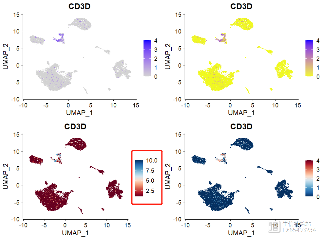
注意左下p3 ,legend是有问题的,会随col参数中brewer.pal(10, name = "RdBu")中的10的数值而变动。
修改大小的话很简单,直接调整 pt.size = 1 即可,此处不做演示。
(2)scCustomize 修改
p11 <- FeaturePlot_scCustom(seurat_object = sce2, features = "CD3D")
p22 <- FeaturePlot_scCustom(seurat_object = sce2, features = "CD3D", colors_use = brewer.pal(11, name = "RdBu"),order = T)
p11 p22
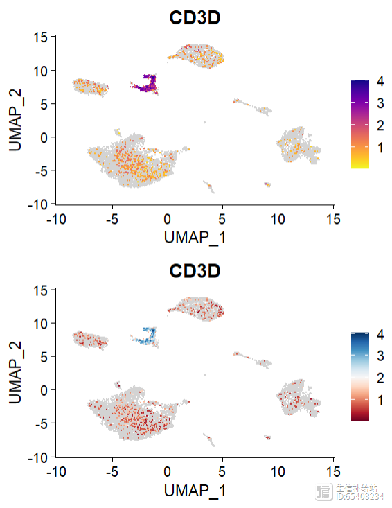
这里cols参数是没有问题的。
2 ,多基因共“表达”
单个基因就按照上面的方法直接绘制即可,如果想同时显示2个基因呢?
(1)Seurat 中提供了 blend = TRUE 函数,来可视化两个基因的共表达情况
FeaturePlot(sce2, features = c("MS4A1", "CD79A"), blend = TRUE)
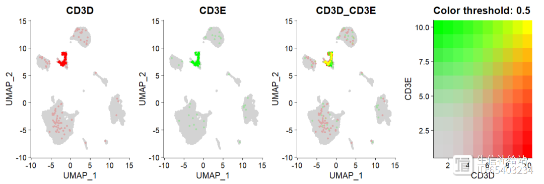
注意blend = TRUE函数只能适用于2个基因,多个基因会报错 。
如果想实现多个基因的话,将目标基因和UMAP 的坐标提取出来使用ggplot2绘制即可 或者 使用scCustomize 包中的多基因联合密度图 ,如下。
(2)scCustomize 多基因联合密度图
密度图是通过Nebulosa包实现的,因此需要先安装Nebulosa 包 。然后用Plot_Density_Joint_Only()函数即可以同时绘制多个基因的联合密度图 ,可以不限于2个基因 。
BiocManager::install("Nebulosa")#单基因p000 <- Plot_Density_Custom(seurat_object = sce2, features = "CD3D")#双基因p111 <- Plot_Density_Joint_Only(seurat_object = sce2,
features = c("CD3D", "CD3E"))#多基因p222 <- Plot_Density_Joint_Only(seurat_object = sce2,
features = c("CD3D", "CD3E","CD79A"),
custom_palette = BlueAndRed())p000 p111 p222
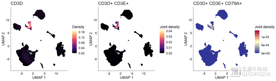
可以通过custom_palette 函数调整颜色,选择较少 。
除了展示共表达外,还可展示目标celltype的几个marker来辅助细胞类型鉴定。
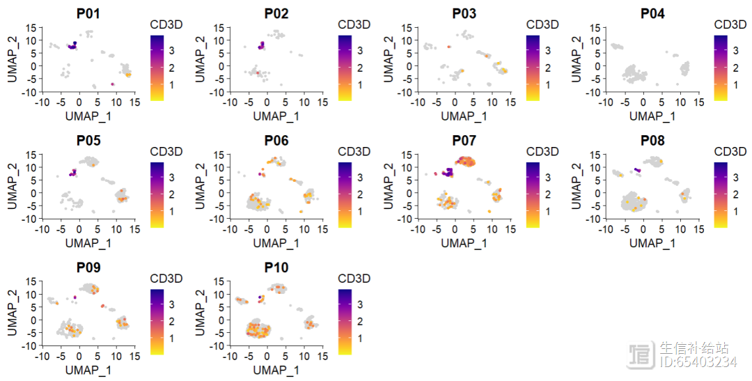
3 , 分组相关
很多时候会需要分样本/分组展示重点基因来进行表达的比较,
(1)Seurat有 split.by 函数 ,虽然可以设置ncol,但是没有效果,如图所示,
sce2sub <- subset(sce2 ,group == "PT")FeaturePlot(sce2sub, "CD3D", cols = brewer.pal(11, name = "RdBu"),
pt.size = 1,
split.by = "sample" ,ncol = 4)
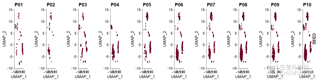
(2)scCustomize 中FeaturePlot_scCustom函数 ,算是修正了这个小bug
FeaturePlot_scCustom(seurat_object = sce2, features = "CD3D", split.by = "orig.ident",
num_columns = 4)
4 ,ggplot2 修改theme / legend 相关
类似前面使用ggplot2的scale修改颜色,当然也可以修改theme等一系列
FeaturePlot(object = sce2, features = "CD3D",pt.size = 1,order = T) scale_colour_gradientn(colours = rev(brewer.pal(n = 10, name = "RdBu"))) DarkTheme() theme(text=element_text(size=14)) theme(text=element_text(face = "bold")) theme(legend.text=element_text(size=8))
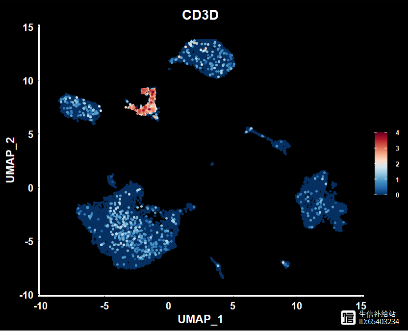
此处简单的示例,更多的参考ggplot2 | 关于标题,坐标轴和图例的细节修改,你可能想了解 , ggplot2|theme主题设置,详解绘图优化-“精雕细琢” ,和ggplot2 |legend参数设置,图形精雕细琢
5 批量绘制
当有多个基因需要绘制时候,需要批量绘制 。
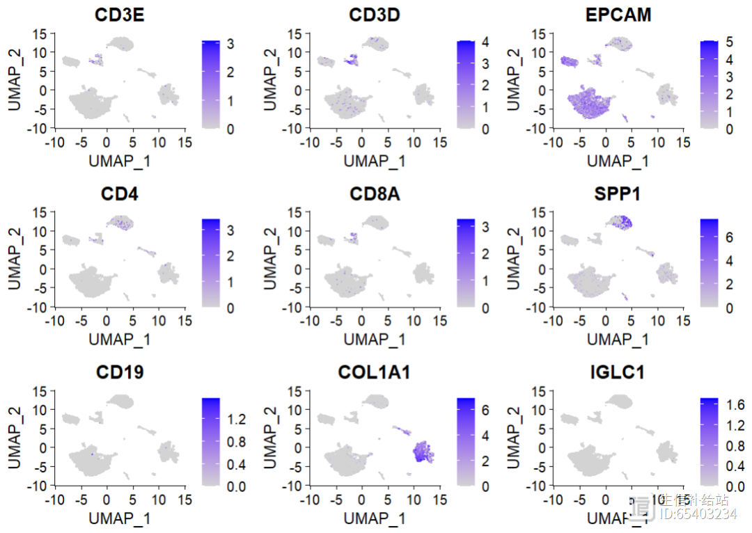
(1)features 可以接受向量,因此可以直接完成
marker_sign <- c("CD3E", 'CD3D', 'EPCAM', 'CD4', 'CD8A','SPP1', 'CD19', 'COL1A1', 'IGLC1')FeaturePlot(sce2,features = marker_sign)
(2)grid.arrange 方式绘制
grid.arrange接受的是list ,可以通过 layout_matrix 调整布局 。当然也可以最开始调整好基因在向量中的顺序,Seurat的结果是一样的 。
intersect_tls <- intersect(marker_sign,rownames(sce2)) plot_list <- lapply(intersect_tls,function(x){ plot_list <- FeaturePlot(sce2,
features = x) })#设置布局lay <- rbind(c(1,2,3),
c(4,5,6),
c(7,8,9))
grid.arrange(grobs = plot_list, layout_matrix = lay)
因为单细胞的FeaturePlot的都是样的,看不出来grid.arrange的优势,后面会介绍空转中使用该函数通过布局 和 选择展示的图片 来绘制CNS级别的主图。
◆ ◆ ◆ ◆ ◆
精心整理(含图PLUS版)|R语言生信分析,可视化(R统计,ggplot2绘图,生信图形可视化汇总)
RNAseq纯生信挖掘思路分享?不,主要是送你代码!(建议收藏)
- 0000


 0000
0000

 0002
0002
 0001
0001
 0000
0000